Marishei Healthcare is continually dedicated to providing the right professionals who are passionate about care, empowered by research-based knowledge and recent medical technologies.
Marishei Healthcare is a new nursing agency specializing in individual patients, providing 24 hour continuous nursing care while they are admitted to the hospital. This approach, tailors treatments and preventive measures to the specific needs of each person.
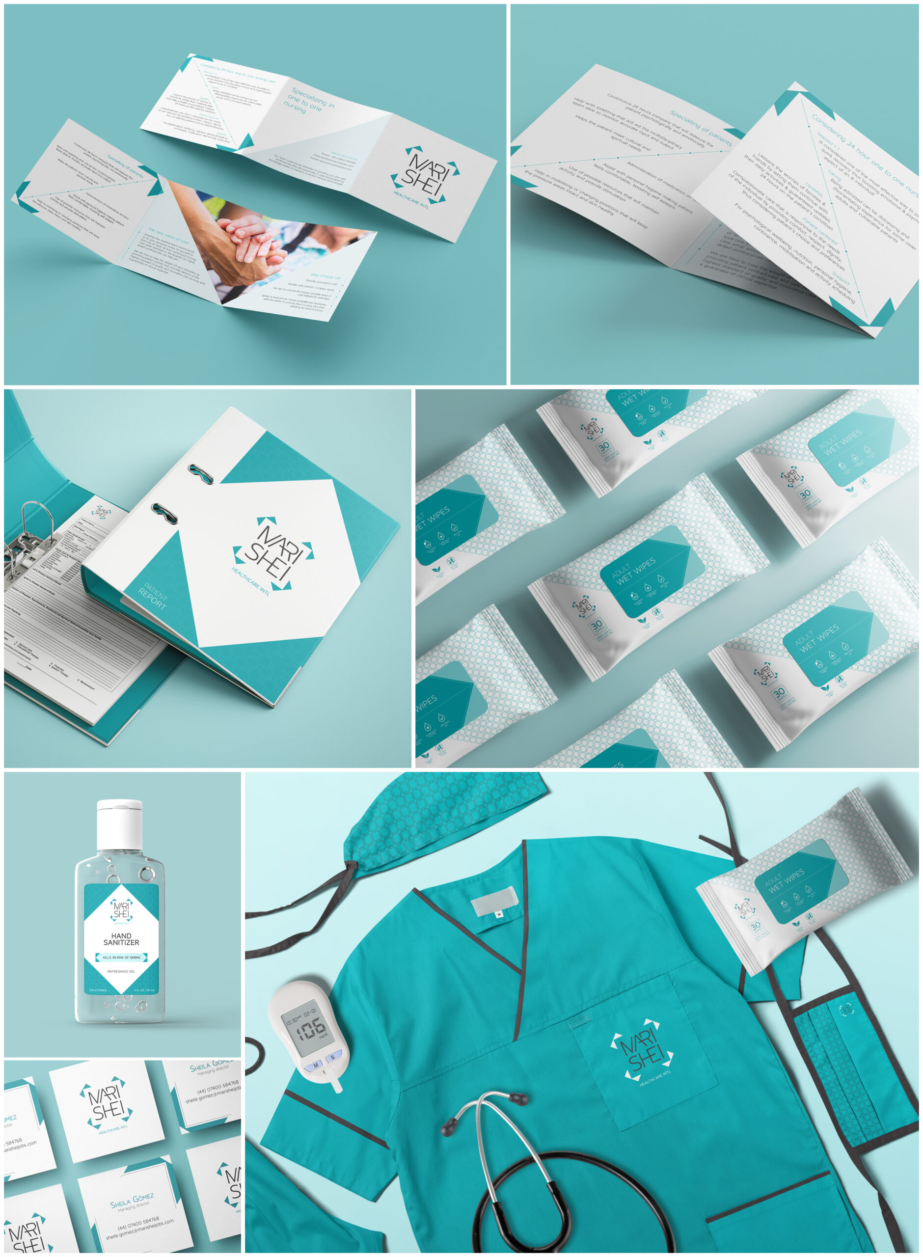
Branding the birth of a new nursing agency
To create the logo, geometric shapes have been used to draw the cross associated with health, within which the name of the agency is accommodated, creating a modern and minimalist but easily recognizable brand.
The design is crafted to reflect the brand's commitment, with clean lines and a selected color palette to evoke feelings of trust, security, professionalism and focus on patient-centric solutions.